Aura Wine Seltzer
Packaging Design
We teamed up with Frank Collective to design the external packaging (a series of can carriers) for Aura Wine Seltzers. Aura came to Frank Collective with the can designs for each of their 4 flavors already completed, so the ask was to create a complimentary design for the outer carrier (box) packaging for each set of cans. With some unique flavor pairings to work from, we developed a series of bright and fruity gradients to be used as the main design elements on the outer packaging. Paired with some product images of the cans, a white wrap-around label, and icons for each flavor, each carrier design developed its own personality in the process. A main goal of Aura was to capture their mantra, "Get Your Glow On," as well as stand out against a sea of popular seltzer competitors. Overall, the final packaging brought each flavor's taste and mood to life, and created a product that was hard to miss on the shelves. Collaborators: Andy Sir (Art Direction), Ashley Stevens (Creative Direction), Frank Collective (Agency)
Gradients
The flavor gradients created for the carrier packaging were the meat and potatoes of the new design, and helped to really bring each product to life through color. Some flavors were more robust, some were lighter, some pairings were similar, and some were unexpected. Each final gradient chosen reflects each of those aspects, as well as the overall "mood" of each product. 
Cherry + Cranberry
The first flavor we focused on was Cherry + Cranberry: the most classic of the four with the richest palette available. We leaned into pinks and purples on the carrier packaging, while including an extra punch of red. The top and bottom of the carrier both feature a full gradient (with the logo, icons and nutritional callouts on top, and the full nutritional info on the bottom). The front, right and left sides feature a white wrap-around label with additional product photography of the cans. 


Peach + Nectarine
Peach + Nectarine was next, and we explored playing up and expanding upon the citrus flavor with the carrier packaging. In addition to warm orange tones, we brought in hints of yellow, pink and red to capture the punch of the nectarine and sweetness of the peach. The top and bottom of the carrier both feature a full gradient (with the logo, icons and nutritional callouts on top, and the full nutritional info on the bottom). The front, right and left sides feature a white wrap-around label with additional product photography of the cans. 


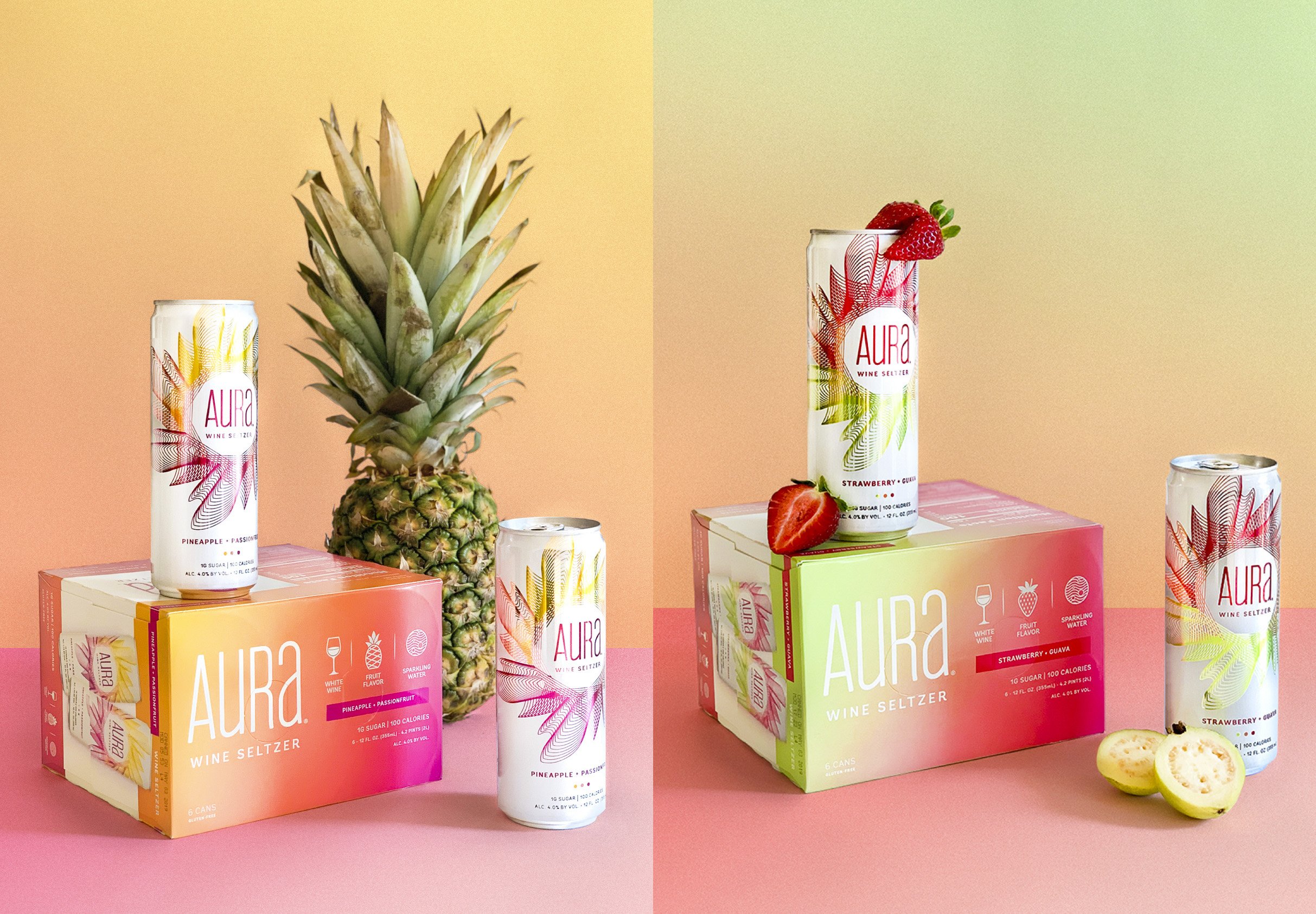
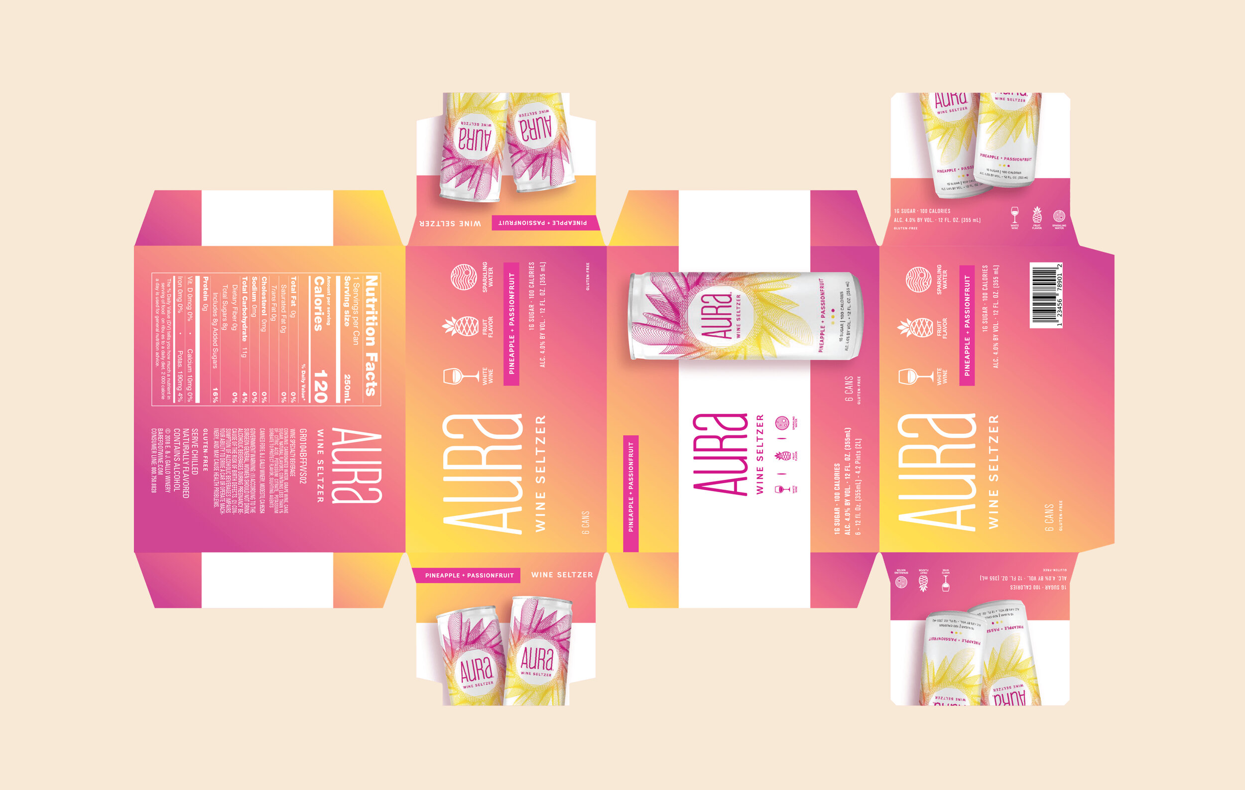
Pineapple + Passionfruit
Pineapple + Passionfruit was the most robust flavor pairing, and gave way to a gradient of warm yellows, oranges, pinks and purples. With such bold flavors, we aimed to capture the perfect mix of citrus and subtle sweetness in the color palette. The top and bottom of the carrier both feature a full gradient (with the logo, icons and nutritional callouts on top, and the full nutritional info on the bottom). The front, right and left sides feature a white wrap-around label with additional product photography of the cans. 

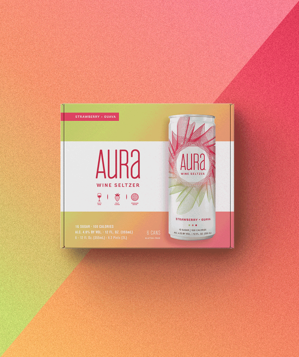
Strawberry + Guava
Strawberry + Guava was the most unexpected flavor pairing and gave us the most room to play. We landed on a light, refreshing palette of cool greens, peaches, pinks and reds for the final gradient. The top and bottom of the carrier both feature a full gradient (with the logo, icons and nutritional callouts on top, and the full nutritional info on the bottom). The front, right and left sides feature a white wrap-around label with additional product photography of the cans.