House of Mal
Naming, Brand Strategy, Brand Identity, Site Design
After multiple successful events and many word of mouth requests, Mallory (the "Mal" behind House of Mal) came to us hoping to take her budding event design + party-planning business to the next level: one with fully baked branding and the ability to scale into an eventual content platform. We worked together doing a deep dive on her business process, goals and values, and House of Mal was born. Mallory's passion is creating thoughtful, elevated events that always feel like a celebration, and we infused every step of the branding process with that energy. In the end, we landed on a final brand identity that feels festive, chic, personal, and most importantly—like Mal. Collaborators: Mallory Schultz
Mood Board
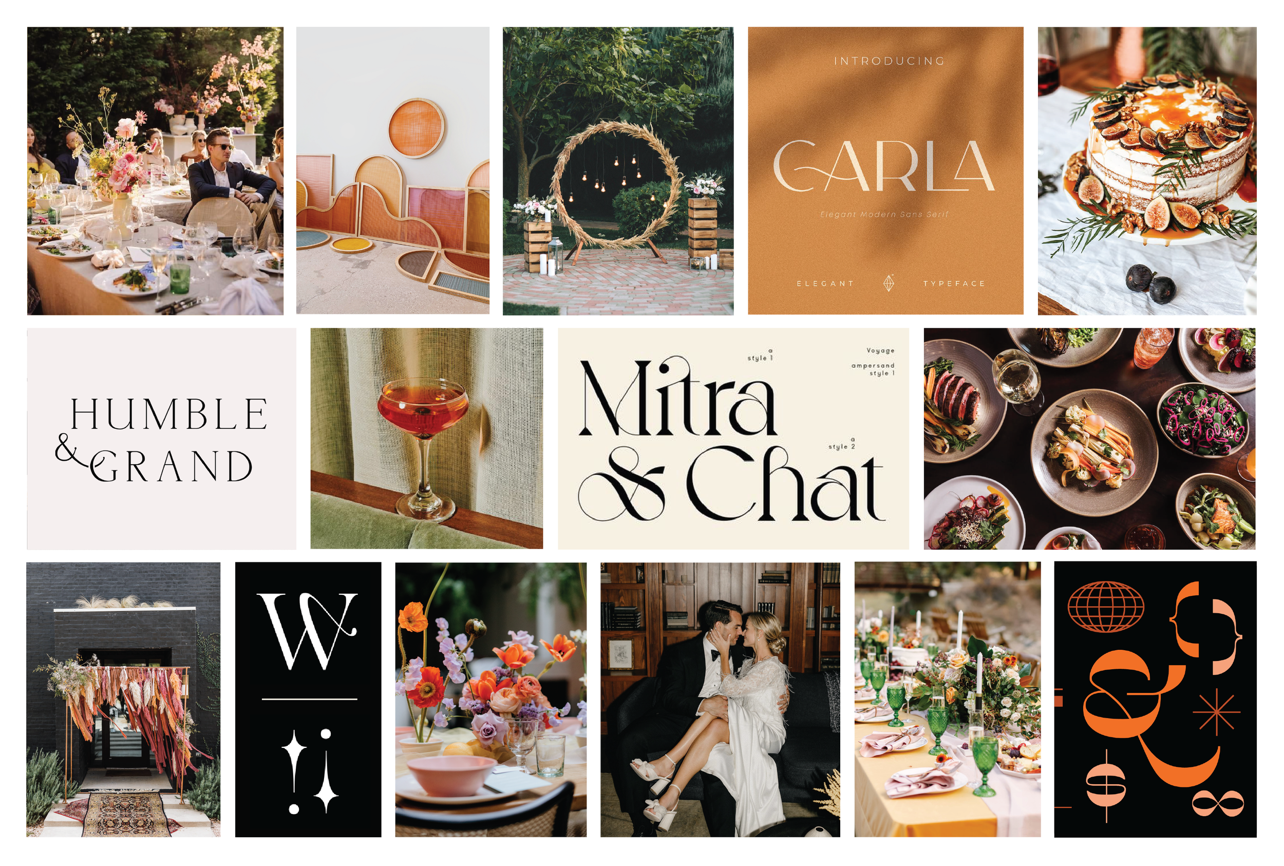
After our initial strategy exploration with Mallory, we were able to identify a few key elements that were inherently House of Mal. Beautiful tablescapes, lush greenery, expressive typography, organic palettes and a hint of retro flair were a few of these pieces that ultimately informed the visual language* of the brand. *These images are not created or owned by X & Co. and are shown purely for inspirational purposes.
Logo
Creating a logo that felt elevated and modern—with a little something "extra"— was our main goal starting the branding process. Ultimately, we landed on a customized version of the Ninna typeface that struck the right balance between feminine and powerful, fun and sophisticated, timeless and approachable. We agreed that adding flourishes on the H and M was the perfect amount of effortless flair for the final logo.Stacked Logo
Horizontal Logo
Color Palette
We wanted to give House of Mal a palette that felt natural and organic, but also really rich. Taking inspiration from lush greenery, ivory table accents, floral details and garnishes, we landed on the final palette below. 
Typography
After nailing down the final logo, we knew we had to bring the sharp sophistication of the Ninna typeface into the rest of the brand typography. We paired Ninna (for headlines) with Freight Pro (for body copy) and Apercu (for CTAs + accents) to push the elevated and well-crafted sensibilities of House of Mal across all collateral. 
Photo Styling
Knowing that photography and documentation would become a major player for Mal in expanding her business, we pulled together a series of photo styling guides* for some key aspects of any event (tablescapes, spaces, people + candids, details) . All the guides share the ideal photographic direction for all House of Mal events, to keep brand visuals consistent. *These images are not created or owned by X & Co. and are shown purely for inspirational purposes.

Tablescapes

Spaces

People + Candids

Details
Site Design
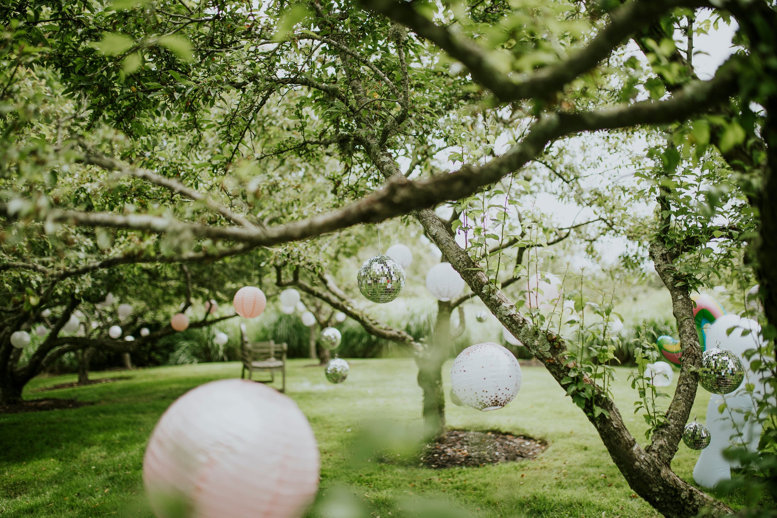
To wrap things up, Mallory wanted an accessible way to generate interest in her business for potential clients—without giving too much away. We landed on creating a single page site design with the House of Mal branding and contact info, featuring imagery from a recent House of Mal event. 